Dissertation Cover
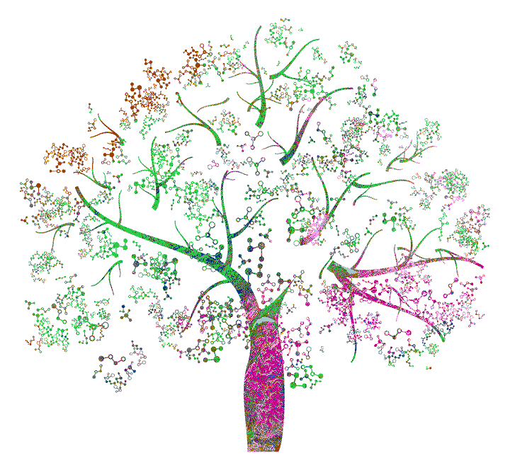 My PhD dissertation cover
The basis of the book cover was a black and white stock image (https://www.shutterstock.com/de/image-vector/molecule-tree-87089435). I liked the image because it vaguely resembles an olive tree while abstractly visualizing dependencies through molecule-style connections. In QGIS, I scaled and projected the image onto gridded data for land-use classification across Europe from the Copernicus database (https://land.copernicus.eu/global/products/lc). I saved the manually reprojected image and performed the following steps in R. Feel free to reach out to me in case you want the corresponding files or the full script.
Load, read, and prepare.
#~ We load some packages and set the working directory
library(raster); library(tmap); library(sf); setwd("YOUR_PATH")

#~ We load the manually prepared files for the tree shape and data
shape   = raster("data/tree.tif")
classes = raster("data/landclass.tif")

#~ Removing the white background is straightforward
shape[shape>=200] = NA
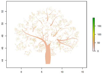
We end up with a raster image of our desired tree-shape in which only the black pixels have values. We can visualize this by using plot(shape). The raster looks as follows (see Figure 1).
Next, we need to change the tree’s pixels to geographic points and extract the land-use data for each point. Because we manually overlaid the shape in QGIS, we know that the coordinate reference system and the general area align with the data. However, note that the manual reprojection is not very scientific! We simply scaled and moved the black and white tree-shape to align nicely over Europe. Do not take any of this too seriously!
Turn pixels into geographic points.
#~ Convert the drawing to geographic points
pts = rasterToPoints(shape, spatial=T)
crs(pts) = crs(classes)
#~ If we want we can plot the result
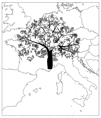
eu = shapefile("data/Europe.shp")
tm_shape(eu)+tm_borders()+tm_shape(pts)+tm_dots(size=0.001)
Figure 2 shows the generated geographic points. The tree shape is made up of around 2.9 million individual points. Given that we have geographic points now, we can easily extract the land-use data.
Because we had moved the tree’s top branches into the North sea when manually reprojecting the image, all points get the same land-use classification and therefore color. This results in a witty reference to Xylella fastidiosa subspecies pauca symptoms. The disease causes branches to desiccate. Of course, you can take any shape you like and follow the same steps. You can also move the shape to wherever you would like it to land! Endless opportunities.
Extract land-use data.
#~ Extract the land classifications for each "location"
pts = data.frame(cbind(pts@coords,landcover=extract(classes,pts)))

#~ Convert data.frame back to a spatial object
pts$landcover    = as.factor(pts$landcover)
coordinates(pts) = ~x+y
crs(pts)         = crs(classes)

#~ Change the variable's categories from numbers to nicer names
levels(pts$landcover) = read.csv("data/levels.csv", sep=";",header=T)$name
We now have categorical data for the land-use in each “location”. This means we can color the categories to our liking and in doing so create a colorful tree in which the color-pattern is determined by the land-use across European! To do so, we pick a few nice color-palettes and randomly shuffle them. I did this many times and picked a nice result for us in the form of hex-color-codes. Note that the next code segment takes quite some time. Because it took so long, below we simply work with the final color-hex-code!
Generate random color-scheme.
#~ Get the number of categories
cats = length(levels(pts$landcover))

#~ Generate a list of four color-palettes we test
colours = list(alphabet   = pals::alphabet(cats),
               glasbey    = pals::glasbey(cats),
               kelly      = pals::kelly(cats),
               polychrome = pals::polychrome(cats))

#~ Visualize 50 shuffles for each palette and save hex-codes
for(n in c("alphabet","glasbey","kelly","polychrome")){
  for(i in 1:50){
    folder      = paste("results/colorruns/",n,"/",sep="")
    cols        = sample(colours[[n]])
    names(cols) = levels(pts$landcover)

    p = tm_shape(pts) + tm_dots(col="landcover", palette=cols, size=0.001) + tm_layout(legend.show=F, frame=F, bg.color="transparent")

    tmap_save(p, paste(folder,i,"_cover.png",sep=""), dpi=3000)
    write.table(cols, paste(folder,i,"_hex.txt",sep=""))
  }
}
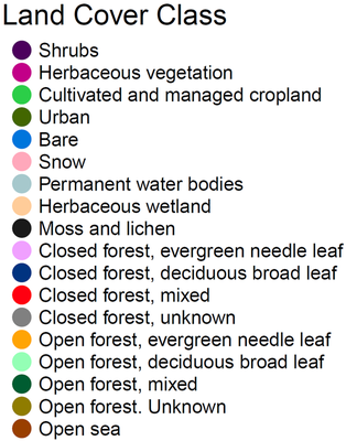
Lastly, we simply need to generate the final visualization and save it. Of course, we want to know what land-use category each color refers to in the final image. Therefore, we save the legend separately and print it here for endless exploration of our generated color-pattern (see Figure 4)! To give you a better orientation for starting your journey, the half-moon shape at the top of the tree’s trunk is Lake Geneva in Switzerland.
Visualize the colored book cover.
#~ Select one of the random color schemes
colours = read.table("results/colorruns/alphabet/2_hex.txt",header=T)$x

#~ Change the names and overwrite one color
names(colours) = levels(pts$landcover)
colours[[7]]   = "#A6C8CC"

#~ Now we just need to generate the plot
p = tm_shape(pts) + tm_dots(col="landcover", palette=colours, size=0.001) + tm_layout(legend.show=F, frame=F, bg.color="transparent")

#~ .EPS is great for working in Photoshop or Illustrator
tmap_save(p, "results/cover.eps", dpi=3000)

#~ Save the color-legend
pdf("legend.pdf")
plot(NULL ,xaxt='n',yaxt='n',bty='n',ylab='',xlab='', xlim=0:1, ylim=0:1)
legend("topleft", pch=16, pt.cex=3, cex=1.3, bty='n',
       legend=names(colours), col = colours)
mtext("Land Cover Class", at=0.2, cex=2)
dev.off()

#~ Never forget to celebrate your victory
print("YAY! YIPPEY! YIIIIIHA!")
Kevin Schneider
Scientific Officer
My research interests include machine learning, simulations, and bio-economic modelling with an agricultural and ecological focus.